The bedroom geometry is taken from one of the lighting challenges, most of the textures I downloaded from http://www.cgtextures.com (the sources for the other textures can be found in a README file). So far this scene uses more textures than any other scene I have published yet, it contains enough objects to be believable. Only two light sources are illuminating the scene, the sun light from outside the room, entering through two windows with blinds (only one windows is visible from the cmaera perspective), and a light emitting bulb inside a lamp shade.
Arnold
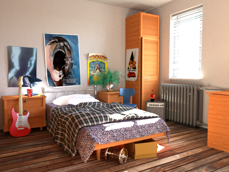
There is not much I do not like about the Arnold version of this scene. I think it’s probably too bright though, the Luxrender version does separate the two light sources a bit better. The dumbbell is probably a bit too shiny and I would prefer a more rusty version. The guitar I would like to have a similar red to the Coca Cola labels, but otherwise the choice of textures and materials works for me.
Luxrender
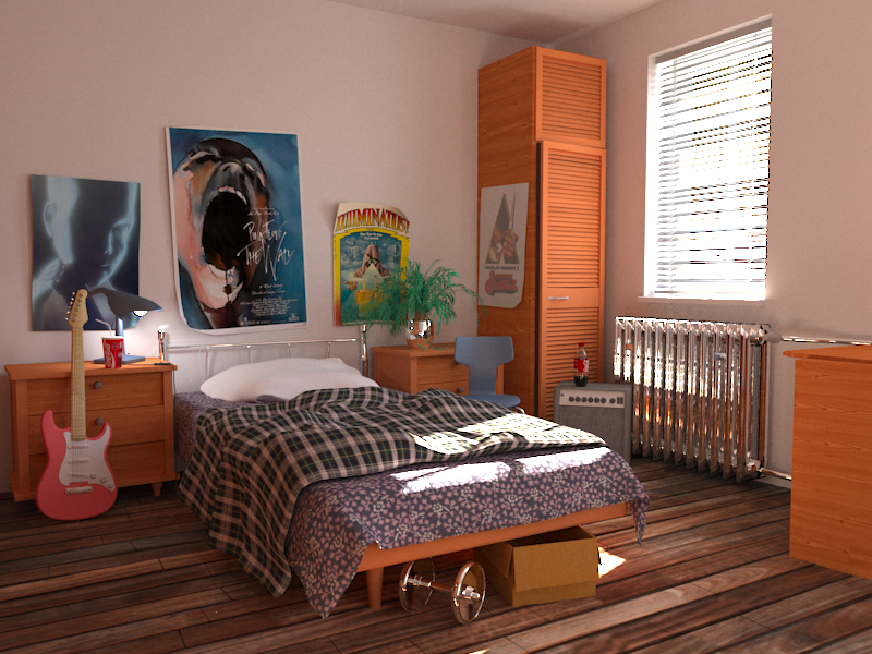
I granted the Luxrender version more rendering hours than the others, simply because I was away for three days in Amsterdam for the Blender conference and kept my desktop computer busy, rendering this scene. I think the weight between the two light sources works best for the images rendered so far. The dumbbell is similar to the Arnold version but should be more rusty. Also the red of the guitar should be changed in the common Blender scene (before exporting). I don’t like the radiator, it’s too shiny. Either my Blender material should be changed or the exporter has bad (Luxrender) heuristics for those kind of materials. Needs a bit of investigation. The aliasing artefacts around the blends (and the light bulb) are a known issue with Luxrender, but maybe there is a workaround, I’m not aware of (yet). What happened to the texture of the Clockwork Orange poster? Somehow the contrast is gone. Why does it not happen for the other textures? Is it the way it receives light?
Cycles
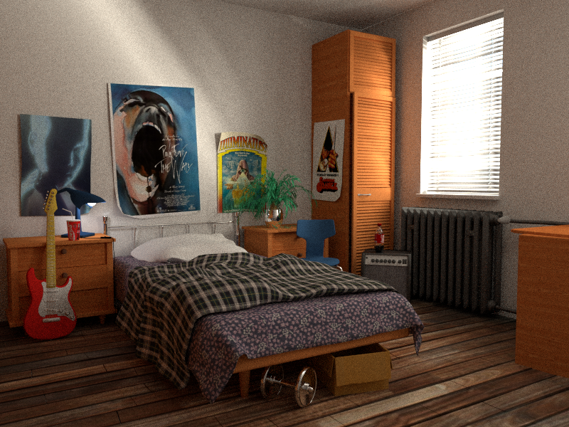
For Cycles the most obvious artefact is that the sun doesn’t seem to get through the windows correctly. Either I made a mistake with related materials or the workaround would be to place area lights outside and in front of the windows to force the effect. I will discuss with the Cycles developers. It would be a shame if we need a workaround just for that one renderer.
Lagoa
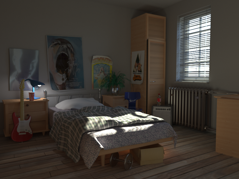
I kind of like the Lagoa rendering as well, even though I think it’s too dark, but it separates the light bulb effect nicely (Lagoa has no light emitters, so I replaced it by a sphere light with a radius similar to the original light bulb geometry). The materials were not automatically generated and I used whatever was there in Lagoa’s user interface and modified it to something similar to the Blender scene, but I thinks the rusty metal for the dumbbell and other more advanced materials work nicely. I also didn’t succeed in matching the direction of the sun 100% using their daylight system, but at least the sun rays touch the blanket and bedsheet in a similar angle.
Using imf_diff
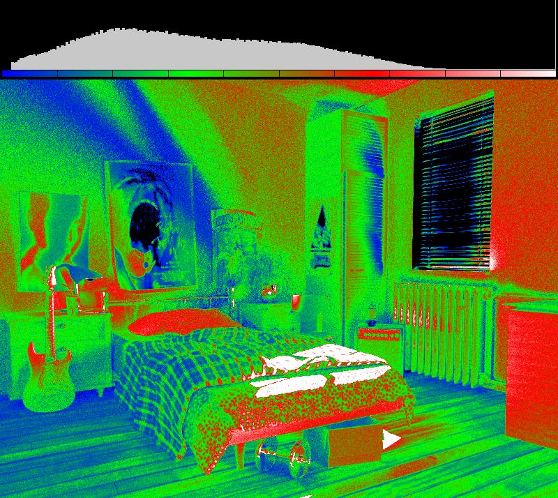
Even though it’s obvious that the sun doesn’t get through with Cycles, here is another example on how to use imf_diff from mental ray to compare two images (using false colors to emphasize the differences):
Credits
- Challenge #21: The Bedroom
- Modeled by David Vacek, design by David Tousek.
- from http://www.3drender.com/challenges
- some textures from http://www.cgtextures.com
